Adventures with Impossible Figures
5. Impossible cuboids
On page 33 we noticed that multi-bars were mostly less effective when the number of lines in the figure became too great. This disadvantage becomes less serious when the overall design reminds us of some well-known form. Our brains seem to be very good at recognising shapes which are similar to those seen before and then noticing small changes.
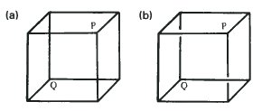
We saw in the last chapter that cuboids of the type given in (a) which are made up of 12 solid lines can be interpreted in two different ways. We are given no information about which line passes in front of which other so there is ambiguity. We can cheat a little, as we have done in (b), and leave a gap in two of the lines. This small change tells the eye that certain lines are nearer. This suggests that P and Q are both the same distance from the observer. An impossibility! But convincing, I hope you will agree.
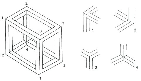
The drawing of the cuboid above is made up of solid bars and so no such ambiguity or cheating is possible. You will see that there are four different kinds of corner and they are sketched separately on the right. The corners of types 1 and 2 alternate round the edge of the diagram and types 3 and 4 are found near the centre.
We can then try to devise new kinds of cuboid by placing different types of corner in different positions.
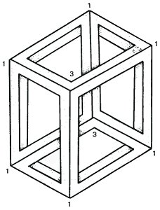
This impossible cuboid uses the corner of type 1 six times round the edge and two corners of type 3 near the centre. It forms a strange shape with the curious property that the visible planes form a continuous ribbon. Try tracing a path along them.
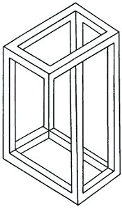
This impossible cuboid is one of a class where the vertical edges have different lengths.
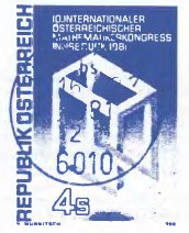
This postage stamp, showing an impossible cuboid, was issued on the occasion of the Tenth International Congress for Mathematics in 1981.
Escher's Belvedere
Some impossible cuboids are too strange for the eye to accept. There may be too many contradictory visual signposts for the eye-brain to come up with a satisfactory interpretation. At this point the drawing collapses into a meaningless collection of lines. To create a successful figure the artist must strengthen some visual clues and weaken others. Then the contradiction between the possible and impossible can create an image which is both intriguing and memorable.
Maurits Cornelis Escher was a master of this art. Let us take a closer look at his print 'BELVEDERE' (1958) on the next page. It is based on the impossible cuboid, but so subtley treated that the cuboid itself is scarcely visible.
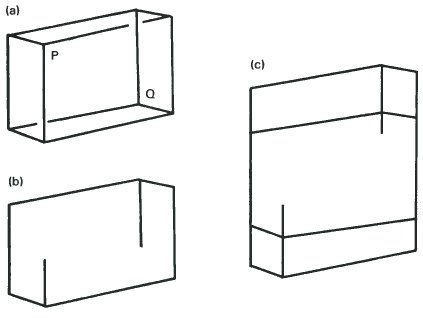
The impossible cuboid is long and narrow and the points P and Q are not far from the edge. This means that there is a relatively large open space in the centre. The most surprising thing is that P is invisible and Q is unobtrusive. Yet they should be the most important points to make us accept the cuboid as real and unreal at the same time. By diminishing some lines as in (b) and then breaking up the outline of the cuboid with an arcade and a ballustrade Escher has weakened the centre. The heavy and detailed construction above and below the weakened centre has strengthened the conflict See (c). We get the impression that the top and bottom planes cross each other perpendicularly and this is emphasized by the directions in which the woman on the top floor and the man on the right are looking.
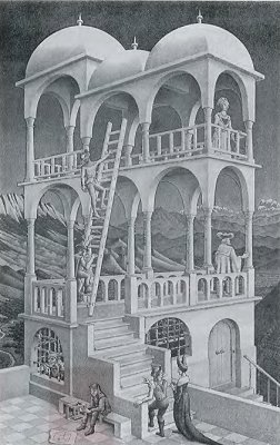
'Belvedere' by Escher (1958)
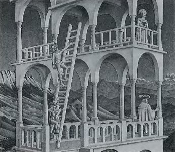
To connect the top and the bottom planes needs a minimum of four pillars, of which the two on the outside cannot contribute to the illusion of impossibility. Escher used eight pillars and six of them contribute to the illusion. Investigate the ends of each pair which make an arch! In doing this he more than compensates for the original loss sustained by camouflaging the points P and Q. And finally there is the ladder which is inside and outside at the same time. This is the absurdity which most people notice first about the print.
At first Escher's work was not taken seriously by art critics and historians. But gradually it became more and more popular and now he is accepted as an artist of the first rank with a unique, rather surrealist style. From his handling of the impossible cuboid in 'BELVEDERE' we can see how effectively he was able to use his vivid imagination to demonstrate his delight in the representation of the impossible. A delight we can all share.
Cuboids with Strange Connections.
The cuboids which we have met so far have had all their corner points joined by beams or lines. However, we find we can make quite a lot of changes without losing the overall impression of a cuboid.
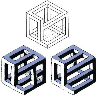
For instance, we can allow some corners to be connected, not to other corners, but to points on the opposite side. For instance a corner could be connected to the middle of a beam opposite. We can experiment with different shadings and unexpected coverings and joinings, some of which produce figures of particular interest. Below are some examples of the kinds of figure we can create.
Unfinished Symphonies
If we remove three of the twelve bars which make up a cube, the eye can still comprehend it as a cube shape. There is no difficulty in the diagram on this page in seeing and accepting the existence of planes in three directions at right angles to each other. The outline and the position of the viewpoint are the same as those of cubes in chapter 4 which could be inverted at will. However, on this page the sense of solidity is so strong that it is only with the utmost difficulty that any sense of inversion can be maintained for more than a few seconds at a time.
On the next page are two figures developed from this one. Notice how the bars have been modified to alter the coverings and their orientation. This field is a rich one for further experiments and there are many interesting variations to discover.
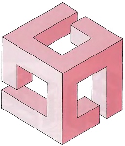
Impossible Windows
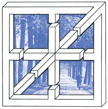
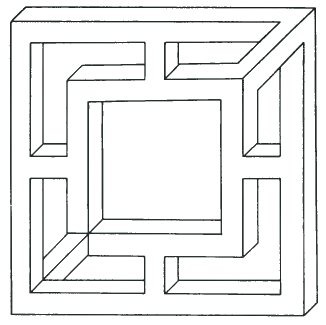
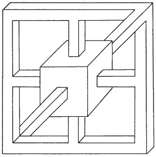
For these drawings I started with an ordinary window frame and then experimented with different kinds of impossible connections.
The figure on this page shows what happens when you try to combine a view through a window with an impossible figure. For me, the tension between the two aspects is very strong and I can scarcely see the frame at all. The rural scene seems to take all of my attention and it is difficult to notice the impossibility of its surroundings. Do try experimenting with different window frames and different photographs.
