The principles of artistic illusions
![]()
Illusory works of art have a curious fascination. They represent a triumph of art over reality. They are illogic masquerading as logic.
Why do illusions capture our interest? Why have so many artists gone to the trouble to produce them? Mountain climbers say they scale mountains "because they are there." Perhaps we seek illusions because they aren't there.
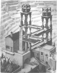
We have all admired the lithograph Waterfall by Maurits C. Escher (1961). His waterfall recycles its water after driving the water wheel. If it could work, this would be the ultimate perpetual motion machine which also delivers power! If we look closely, we see that the artist is deceiving us, and any attempt to build this structure in masonry would be doomed to failure.
All M. C. Escher works © - Cordon Art B. V. - P.O. Box 101-3740 Ac - Baarn - The Netherlands. All rights reserved. M.C. Escher (TM) is a Trademark of Cordon Art. Used by permission. The examples used here were scanned by Paul Schofield and may be seen at his site The World of Escher, which also has many other Escher pictures.
Isometric drawings
Two-dimensional drawings (on a flat surface) can be made to convey an illusion of three dimensional reality. Usually this deception is employed to depict real, solid objects in spatial relationships achievable in our world of sensory experience.
The conventions of classical perspective are very effective at simulating such reality, permitting 'photographic' representation of nature. This representation is incomplete in several ways. It does not allow us to see the scene from different vantage points, to walk into it, or two view objects from all sides. It does not even give us the stereoscopic depth sensation which a real object would have due to the lateral separation of our two eyes. A flat painting or drawing represents a scene from only one fixed viewpoint, as does an ordinary monocular photograph.
One class of illusions appear at first look to be ordinary 'perspective' renderings of solid, three dimensional objects or scenes. But on closer examination, they reveal internal contradictions such that the three dimensional object(s) they depict could not exist in reality. These have a special fascination for those of us used to the convention of depicting nature on a flat surface of paper, canvas, or in a photograph.
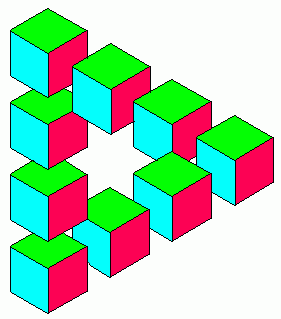
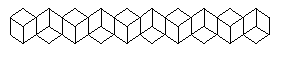
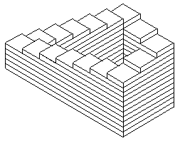
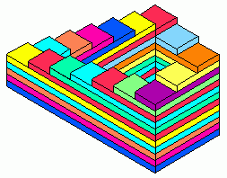
Isometric illusory art was created as early as 1934 by Swedish Artist Oscar Reutersvärd with the impossible arrangement of blocks shown here. The colors in this version are not to be blamed on Oscar. This design has been widely used, and even appears on a Swedish postage stamp.
The penrose illusion
One particular example of the Reutersvard illusion is sometimes called the 'Penrose' or 'tribar' illusion. Its simplest form is illustrated here.
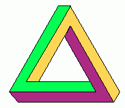 It appears to be three bars of square cross section joined to form a
triangle. If you cover up any one corner of this figure, the three bars
appear to be fastened together properly at right angles to each other at
the other two corners-a perfectly normal situation. But now if you
slowly uncover a corner it becomes apparent that deception is involved.
These two bars which connect at this corner wouldn't even be near each
other if they were joined properly at the other two corners.
It appears to be three bars of square cross section joined to form a
triangle. If you cover up any one corner of this figure, the three bars
appear to be fastened together properly at right angles to each other at
the other two corners-a perfectly normal situation. But now if you
slowly uncover a corner it becomes apparent that deception is involved.
These two bars which connect at this corner wouldn't even be near each
other if they were joined properly at the other two corners.
The Penrose illusion depends 'false perspective,' the same kind used in engineering 'isometric' drawings. This kind of picture displays an inherent ambiguity of depth, which we will call isometric depth ambiguity.'
 Isometric drawings represent all parallel lines as parallel, even if they
are tilted with respect to the observer. An object tilted away from the
observer by some angle looks the same as if were tilted toward the
observer by the same angle. A tilted rectangle has a two-fold ambiguity,
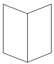
as demonstrated by Mach's figure (right) which may be seen as an open book
with pages facing you, or as the covers of a book, with the spine facing
you. It may also be seen as two symmetric parallelograms side by side and
lying in a plane, but few people describe it that way.
Isometric drawings represent all parallel lines as parallel, even if they
are tilted with respect to the observer. An object tilted away from the
observer by some angle looks the same as if were tilted toward the
observer by the same angle. A tilted rectangle has a two-fold ambiguity,
as demonstrated by Mach's figure (right) which may be seen as an open book
with pages facing you, or as the covers of a book, with the spine facing
you. It may also be seen as two symmetric parallelograms side by side and
lying in a plane, but few people describe it that way.
The Thiery figure (above) illustrates the same idea.
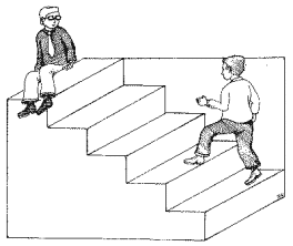
Schroeder's reversible staircase illusion is a very 'pure' example of isometric depth ambiguity. It may be perceived as a stairway which one could ascend from right to left, or as the underside of a stairway, seen from below. Any attempt to draw this with vanishing points would destroy the illusion.
The illusion can be enhanced by adding recognizable figures, as in the version at the right is © 2001 by John C. Holden. It should carry an OSHA warning: Caution: Illusory stairways can be hazardous.
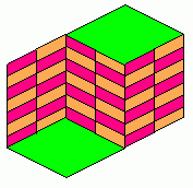
The simple design below looks like three faces of a string of cubes, seen either from the outside, or the inside. If you put your mind to it, you can see them as alternating: inside, outside, inside. But it's very hard, even if you try, to see at as simply a pattern of parallelograms in a plane.
Blackening some facets enhances the illusion, as is shown below. The black parallelograms at the top are seen either as from below, or from above. Try as hard as you can to see them as alternating, one from below, one from above, and so on, left to right. Most people can't. Why should we be unable to do this? This is, I think, one of the most baffling of the simple illusions.
![]()
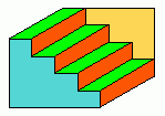
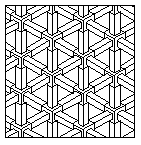 The design at the right uses the tribar illusion relentlessly in strict
isometric drawing style. This is one of the 'hatching' patterns of the
AutoCAD (TM) computer graphics program. It is called the 'Escher' hatching
pattern.
The design at the right uses the tribar illusion relentlessly in strict
isometric drawing style. This is one of the 'hatching' patterns of the
AutoCAD (TM) computer graphics program. It is called the 'Escher' hatching
pattern.
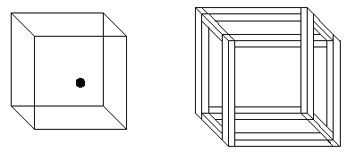
The isometric wire-frame drawing of a cube (below left) shows isometric ambiguity. This is sometimes called the Necker cube. If the black dot is on the center of a face of the cube, is that face the front, or the rear face? You can also imagine the dot is near the lower right corner of a face, but still you can't be sure if it is the front or rear face. You have no reason to assume that the dot is in or even on the cube, but might be behind or in front of the cube, since you have no clue about the size of the dot.
If the edges of the cube are given a suggestion of solidity, as if the cube were made of wooden 2x4s nailed together, a contradictory figure results. But here we have used ambiguous connectivity of the horizontal members, which will be discussed in the next section. This version is called the crazy crate, and is suitable as the frame of a shipping crate for illusions. It's really a challenge to nail the plywood faces onto the frame to complete the crate, to keep the illusions from falling out!
Photographing illusions
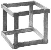 The crazy crate cannot be made of lumber. Yet the photo shown here is
of something made of lumber, which certainly looks like the crazy
crate. It is a cheat. One piece, which seems to pass behind another, is
actually two pieces with a break, one nearer, one farther than the
crossing piece. This only seems to be a crate from one particular viewing
point. If you looked at the real thing from near this point, your
stereoscopic vision would give the trick away. If you moved your head from
the viewing point for which it was designed, you'd see the trick. In
museum displays of this you are forced to look through a small hole in a
wall, using only one eye.
The crazy crate cannot be made of lumber. Yet the photo shown here is
of something made of lumber, which certainly looks like the crazy
crate. It is a cheat. One piece, which seems to pass behind another, is
actually two pieces with a break, one nearer, one farther than the
crossing piece. This only seems to be a crate from one particular viewing
point. If you looked at the real thing from near this point, your
stereoscopic vision would give the trick away. If you moved your head from
the viewing point for which it was designed, you'd see the trick. In
museum displays of this you are forced to look through a small hole in a
wall, using only one eye.
To make such a photograph, one has to engage in deception. If an ordinary camera is used, the more distant lumber pieces would subtend a smaller angle than the nearer ones. So the more distant ones must be made physically larger, and those which have one end nearer than the other end must be tapered in size from one end to the other.
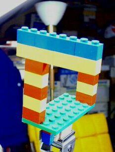
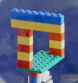
There's another way to accomplish this for smaller objects. The small model below left is made of plastic Quobo ® bricks, 1 cm high. The entire model is over 7 cm high. Notice that there's a size disparity where the nearer yellow horizontal tier touches the more distant red brick. But in the picture to the right, there is no size difference there. Note also in the picture to the right, that all bricks subtend the same angle, opposite edges of the green base are parallel and all other parallel lines of the model are parallel on the picture. This is an isometric photograph.
The normal photo on the left shows the chair and lamp behind, as well as other clutter of a small room. It was taken with a digital camera with the subject only about 30 cm from the lens.
The photo on the right was taken with the same camera, and approximately the same subject distance. But a telecentric optical system was used, consisting of a large 13 cm diameter lens placed with its focal point very near the camera's own lens. This particular large lens didn't have high quality (it was molded, not polished), so the resolution of the picture is poorer. Such systems suffer from the problem that any dust or scratches or other defects on the lens can show in the final picture. Use of a single lens also produces "pincuschion" distortion which renders straight lines as slightly curved.
Telecentric lens systems of high quality are used in industry for product inspection, and in microscopy, for increased depth of focus (DOF). They are limited to photographing small objects smaller than the diameter of the front surface of the lens. See: Telecentric systems.
For some subjects one can "get away" with this kind of deception by using a telephoto lens of high magnification and having the subject very distant from the camera.
 Ambigous connectivity
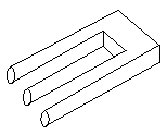
Some illusions depend on the ambiguous connectivity possible in line drawings. This three (?) tined fork above is sometimes called Schuster's conundrum. It could be drawn in perspective, but natural shading or shadowing would destroy the illusion.
What's the basis of this illusion? Is this a variation on Mach's 'open book' illusion? Certainly the drawing is isometric.
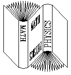 Actually this is a combination of Mach's illusion and ambiguous
connectivity. The two books share a common front cover. This makes the
tilt of the book cover even more ambiguous.
Actually this is a combination of Mach's illusion and ambiguous
connectivity. The two books share a common front cover. This makes the
tilt of the book cover even more ambiguous.
Some use the general term undecidable figure to describe these pictures. That term is so broad that it could be applied to nearly all illusions.
Here's illusory musical tuning-fork, with only two tines. The figure on the right shows it's perspective, with vanishing points.
Illusions of shape
Closely related to alignment illusions are those where a dominating pattern alters our judgment of a geometric shape. The example below is similar to the Zoelner, Wundt, and Herring illusions in which the pattern of short diagonal lines distorts the long parallel lines. [Yes, the horizontal lines are perfectly straight and parallel. Check them on the printed copy with a ruler.]
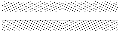
These illusions take advantage of the way our brains process information containing repeating patterns. One regular pattern can dominate so strongly that other patterns appear distorted.
A classic example is the pattern of concentric circles with a superimposed square. Though the sides of the square are absolutely straight, they appear curved. The straightness of the square's sides may be checked by laying a ruler along them. This effect is found in many illusions of shape.
The same principle is at work in this example. Though the two circles are exactly the same size, one looks smaller. This is one of many illusions of size. It is a close relative of the "Ponzo Illusion".
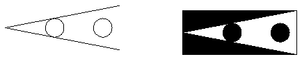
Some have 'explained' this illusion as a result of our experience with perspective in photographs and works of art. We interpret the two lines as 'parallel' lines receding to a vanishing point, and therefore the circle not touching the lines must be nearer, and hence larger.
 The same picture is shown (above right) with darker circles, and the
parallel lines have become part of dark triangles. If the 'receding
parallel line' theory were correct, this illusion should be weaker. You be
the judge.
The same picture is shown (above right) with darker circles, and the
parallel lines have become part of dark triangles. If the 'receding
parallel line' theory were correct, this illusion should be weaker. You be
the judge.
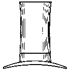
The width of the brim of this hat is the same as its height, though it doesn't seem so at first look. Try turning the picture on its side. Is the illusion the same? This is an illusion of relative dimensions within a picture, which is a distortion of shape.
 Illusions of alignment
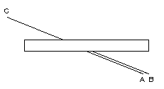
The Poggendorf illusion, or 'crossed bar' illusion invites us to judge which line, A or B, is aligned exactly with C. A good ruler can be used on the printed copy to check your answer.
Ambigous ellipses
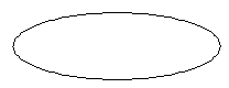 Tilted circles appear as ellipses. Circles drawn in perspective appear on
the page as ellipses, and ellipses have an inherent ambiguity of depth. If
this figure represents a circle seen tilted, there's no way to tell
whether the top arc is nearer or farther than the bottom arc.
Tilted circles appear as ellipses. Circles drawn in perspective appear on
the page as ellipses, and ellipses have an inherent ambiguity of depth. If
this figure represents a circle seen tilted, there's no way to tell
whether the top arc is nearer or farther than the bottom arc.
Ambiguous connectivity is also an essential element of this ambiguous ring illusion:
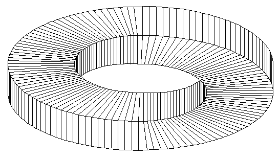
Ambiguous Ring, © Donald E. Simanek, 1996.
Cover about one third of the picture at either end, and the rest of the picture looks like part of a very normal ring or washer.
 When I devised this picture I thought that it might be an entirely
original illusion. But then I noticed an advertisement with the corporate
logo of the Canstar corporation, a manufacturer of fiber optics. Canstar's
version is different from mine, however, for the surfaces have different
connectivity. Still these two may be considered in the same class of
illusion. This is another case of two great minds independently inventing
the non-existent wheel! If we dig deeply enough, we'd probably find even
earlier examples.
When I devised this picture I thought that it might be an entirely
original illusion. But then I noticed an advertisement with the corporate
logo of the Canstar corporation, a manufacturer of fiber optics. Canstar's
version is different from mine, however, for the surfaces have different
connectivity. Still these two may be considered in the same class of
illusion. This is another case of two great minds independently inventing
the non-existent wheel! If we dig deeply enough, we'd probably find even
earlier examples.
The endless staircase
The other classic Penrose illusion is the impossible staircase. This illusion is often rendered as an isometric drawing, even in the Penrose paper. Our version is identical to that of the Penrose paper, except for its lack of shading. The color version to the right allows you to follow a particular color on a step through the layers below. You discover that there aren't enough layers for all the steps.
This could be drawn with vanishing points in full perspective. M. C. Escher, in his 1960 lithograph Ascending and Descending, (above) chose to construct the deception in a different manner. He placed the staircase on the roof of a building and structured the building below to convey an impression of conformity to strong (but inconsistent!) vanishing points. He has the right vanishing point higher than the left one.
One task artists have not yet successfully addressed is to draw an illusion picture with its shadow. Just as shading could kill an illusion, its shadow could also give away the illusion. Possibly an artist could be clever enough to place the light source in such a location that the shadow would be consistent with the rest of the picture. Maybe the shadow could become an illusion itself! The possibilities boggle the mind.
Seeing Illusions
Some persons look at these illusion pictures and are not at all intrigued. "Just a mis-made picture," some will say. Some, perhaps less than 1 percent of the population, do not 'get' the point because their brains do not process flat pictures into three dimensional images. These same persons have trouble with ordinary engineering line drawings and textbook illustrations of three dimensional structures.
Others can see that 'something is wrong' with the picture, but are not fascinated enough to inquire how the deception was accomplished. These are people who go through life never quite understanding, or caring, how the world works, because they can't be bothered with the details, and lack the appropriate intellectual curiosity.
It may be that the appreciation of such visual paradoxes is one sign of that kind of creativity possessed by the best mathematicians, scientists and artists. M. C. Escher's artistic output included many illusion pictures and highly geometric pictures, which some might dismiss as 'intellectual mathematical games' rather than art. But they hold a special fascination for mathematicians and scientists.
It is said that people in isolated parts of the world, who have never seen photographs, cannot at first understand what a photograph depicts when it is shown to them. The interpretation of this particular kind of visual representation is a learned skill. Some learn it more fully than others.
Historically, artists learned geometric perspective and used it long before the photographic process was invented. But they did not learn it without help from science. Lenses became generally available in the 16th century, and one early use of lenses was in the camera obscura. A large lens was put in a hole in the wall of a darkened room so that an upside down image was cast on the opposite wall. The addition of a mirror allowed the image to be cast onto a flat floor or table top, and the image could even be traced. This was used by artists who experimented with the new 'European' perspective style in art. It was aided by the fact that mathematics had developed enough sophistication to put the principles of perspective on a sound theoretical basis, and these principles found their way into books for artists.
It is only by actually trying to make illusion pictures that one begins to appreciate the subtlety required for such deceptions. Very often the nature of the illusion seems to constrain the whole picture, forcing its 'logic' on the artist. It becomes a battle of wits, the wit of the artist against the strange illogic of the illusion.
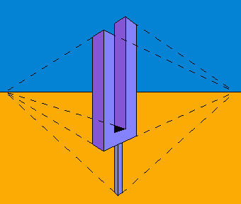
Now that we've discussed some of the deceptions which may be used in artistic illusions, you may use them to create your own illusions, and to classify any illusions you run across. Soon you'll have quite a collection, and will need some way to display them. I've designed an appropriate glass display case, shown to the right.
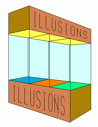
Display Case For Illusions,
© Donald E. Simanek, 1996.
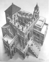
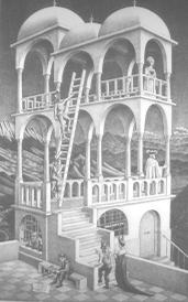
The reader may wish to check the consistency of the vanishing points, and other aspects of the geometry of this drawing. By analyzing such pictures, and trying to draw them, one can gain a real understanding of the deceptions used in the picture. M. C. Escher used similar tricks in his architecturaly impossible Belvedere (below).
For further reading
Several websites feature the work of Oscar Reutersvärd:
- Oscar Reutersvärd, founding father of impossible objects.
- Oscar Reutersvärd, The father of impossible objects.
A web browser search will turn up many more.
-- Donald E. Simanek
![]()
This document is an ongoing project, for which feedback is welcomed by the author. E-mail to: dsimanek@lhup.edu
Copyright © Donald E. Simanek, December 1996
Reprinted from http://www.lhup.edu/~dsimanek/3d/illus1.htm